I don’t think there has ever been a time in my existence when I wasn’t fascinated by the small details of life. My mother has told me stories of how ridiculously long it took to walk anywhere with me when I was a toddler as I kept stopping every few feet or so to inspect something that had caught my interest. For anyone who’s ever had the experience of walking somewhere with me today, they can probably attest that not a lot has changed! *GRIN*
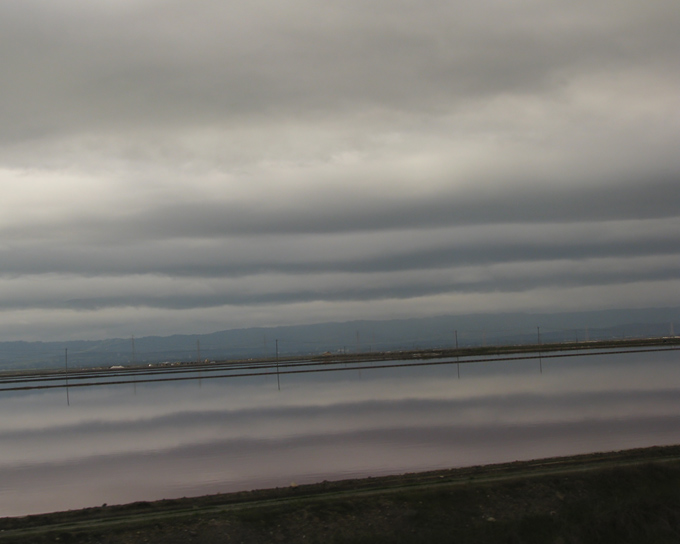
Though it can be distracting (and occasionally overwhelming), my heightened attention to very small details is not a trait I would ever really want to change. I think it is an essential component of being a good naturalist… and photographer too. Being able to see small differences in two different shots can be very useful when editing a large number of images. Paying attention to how an image makes you feel if you alter the exposure a little or experiment with a slightly different crop can really improve your finished product. Of course, sometimes I wonder if the things I get hung-up on are perhaps too subtle for most people to care about. For instance, I was working on this image today:

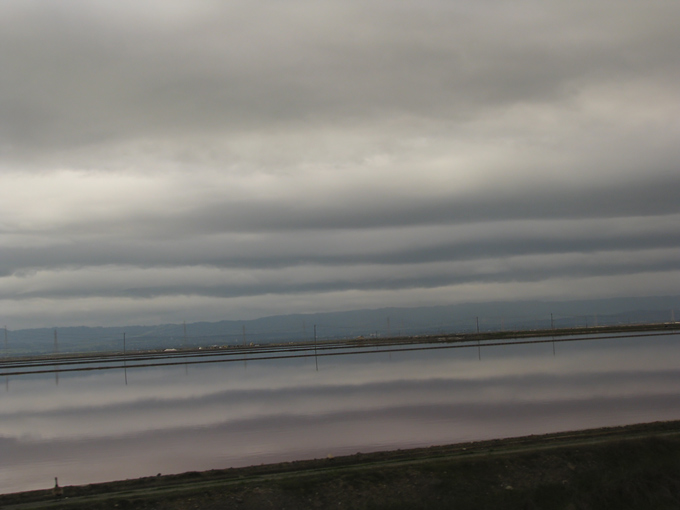
This gorgeous scene was captured from the window of the train on the return leg of our trip to Seattle. The body of water paralleling the tracks provided a perfect mirror image of the striated sky above. The colors were subtle and perfect. This is the image I took, full-frame, nothing done in post-processing except to adjust the exposure a bit. I wanted this to feel somewhat abstract. I wanted it to be more about the repeating colors and lines than about the context of the scenery per se. As I stared at the above image, something just wasn’t sitting right for me. So, I cropped it, like this:

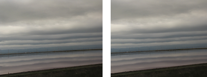
If you can immediately tell the difference between these two shots… well then, I am impressed! This crop did serve some practical purpose because my camera creates images that are roughly 8 x 10.6 inches. These dimensions are not particularly useful for making prints and cropping this to a standard size of 8 x 10 inches makes sense. But, that’s not why I did it. My reasons were far less obvious…
I am always trying to understand how someone’s eye reads a photo or piece of artwork. I think there are ways to guide the eye. To subtly suggest where the focus should be and how the eye travels to get there. My goal with this piece was to have the viewer’s eye follow the repeating horizontal lines in a way that would feel seamless… flowing, I suppose. Back and forth, like a typewriter, spewing pastel lines of clouds and water. I wanted to include the land below the water because it anchored the whole scene a bit and gave a hint of context. But foreground — especially darker foreground — is always going to draw the eye, and in this case, my attention kept being inexorably drawn to that tiny dark blob in the lower left corner. A little bump that made me stop and scrutinize when I wanted to just keep gliding back and forth.
At this point — if you’re still reading — you’re probably thinking 1) this woman is more than a little neurotic, and 2) does it really make any appreciable difference? Well, I freely admit to the first point… and as to the second, who knows? I felt instantly better about the whole thing after cropping it, but I have no idea how it translates to others. I’d be happy to hear what you think! Here are the two images side-by-side:
 *Click on this (and the above images) if you want to see a larger view.*
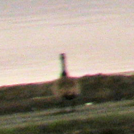
Eventually, after staring at these two images for long enough and putting this blog post together, I began to second-guess myself. What was the big deal with the little blob anyway??? It finally dawned on me that it was the “blob” part that wasn’t working for me. Though a small protrusion, it poked up out of an otherwise congruous series of lines and drew attention. But then, to further frustrate things, I simply couldn’t resolve what I was looking at and that made my eye linger even longer on this spot. At this point, curiosity got the better of me and I enlarged the image and seriously increased the exposure to get a better view of the inscrutable dark lump.

Surprise! It’s a GOOSE!!! A Canada Goose, with its back to the camera, to be exact. Hah! Now, if this goose had been more visible, recognizable as a goose from a distance, there is no way that I ever would’ve considered cropping it out. That would have been a perfect destination for the viewer’s eye — traveling across the image and settling on this lone bird also surveying the unfolding scenery. Ahhh, but it wasn’t meant to be this time around, I guess.
Hmmm… re-reading this post, it seems awfully long and meandering. Not sure if anything I’ve written will be of interest to anyone. Just trying to give some insight into my creative process, which at times can perhaps be overly rigorous. More and more, I recognize that I must give myself more freedom to have fun and be spontaneous with my photography… but, the details do matter to me and they probably always will. And… I’m OK with that!
