Making it Work

I sat down today to work on prepping those Mule Deer images I promised. Several young males (last year’s fawns) have been hanging about lately. Adult females and their spotted little ones share their company as they make daily visits around the perimeter of the cabin. They stop to get a drink of water, nibble on the plants and bushes, and to lay in the cool, shady areas. In photographing them, I managed to capture some wonderful expressions and behavior. However, as is often the case (especially if I attempt to shoot through the kitchen window), I found myself unhappy with the quality of the photos. It’s not that they’re horrible, they simply suffer from various problems like soft focus, contrasty lighting, improper exposure or unwanted objects. Using a graphics program like Photoshop, there are countless ways to attempt to improve or fix these issues. Some times I go that route… But, other times, I find that if an image needs a significant amount of manipulation it’s just more fun to unleash my creativity instead of trying to make it look like the perfect photograph I had imagined. By playing with the digital filters and brushes, altering the color palette or lighting, it’s possible to create a myriad of artistic effects.

I thought it might be interesting to start by showing you this image exactly as it looked after I downloaded it from my camera:
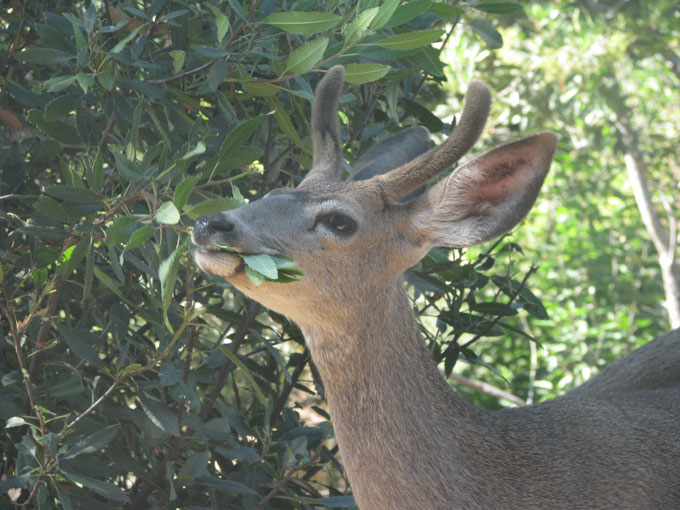
Mule Deer, male eating Toyon

This young male was so blissfully chewing away on the Toyon leaves, that he hardly seemed to notice me standing at the window taking photos. It was a beautiful few moments. But, the image looked so washed out and lifeless to me. I wanted to try and add more of the warmth and intimacy that I had felt. Also, the background was very bright and eye-catching, so I hoped to even out the light some, make it twinkle a bit, and highlight all the wonderful leaves.

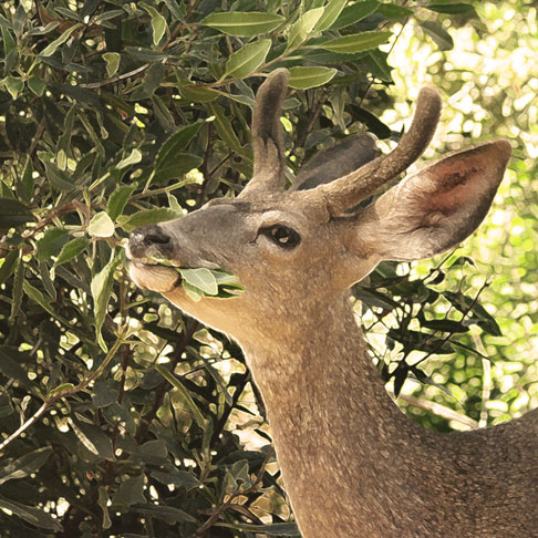
Mule Deer, male eating Toyon (filtered)

I liked the way the deer fills this square crop and the painterly effect is very close to what I had envisioned. (If anyone is interested, I used the “Accented Edges” filter and then experimented with the color and exposure.)

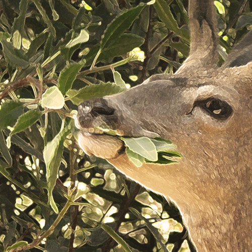
I know it can be very hard to get a feel for the subtleties of the texture and brush strokes with the small size of web presentation. I usually do provide a larger version that can be seen my clicking on the image, but it is still a very limited view. So, here is a crop showing just a portion of the above image so that you can see more detail.

Mule Deer, male eating Toyon (filtered)


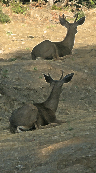
In this next instance, you can see an example of an original image which is really not very good. But, I so loved the composition and the delightful scene it portrayed that I wanted to try and do something nice with it.
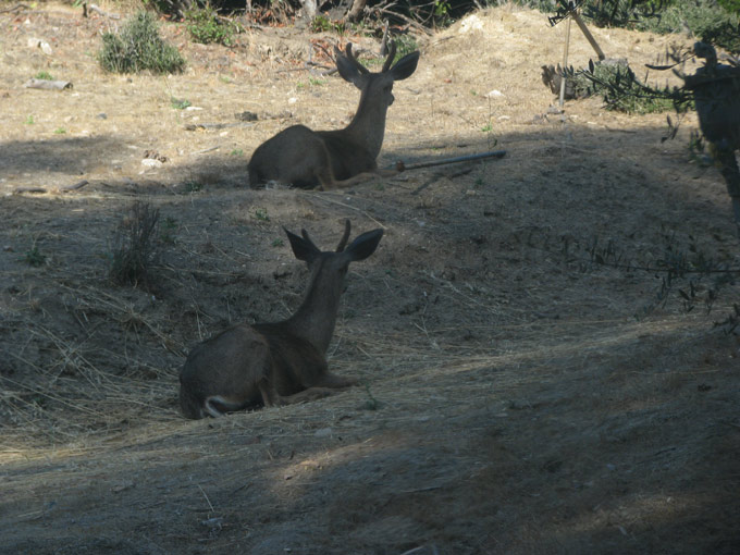
Mule Deer, two males resting

These two young males decided to lay down near each other in late afternoon shade. They were just within view through my kitchen window and they weren’t going anywhere, but no matter how many photos I took, the glass distortion and lighting conspired to leave me with less than satisfactory shots. Additionally, there was that exposed (defunct) pipe jutting out off the ground next to the upper deer in every single image. It was the layered appearance of the background and the repeating shapes of the deer that had compelled me to take the photo in the first place, so I tried to focus on those elements when cropping and transforming it. (In this case, the filtering process also makes it very easy to seamlessly clone a portion of the background to obscure the unattractive pipe.)


Mule Deer, two males resting (filtered)


Though I don’t always succeed, it is always my goal to accomplish something that is better than the original photo. To create something that tugs at the essence of what I saw when I first lifted my camera, but then draws it out further… Exaggerating it to evoke an emotion or feeling that might otherwise have gone unnoticed.
 

Harsi / August 1, 2011 / artwork, mammals, photography / 2 Comments

(mir)ror im(age)


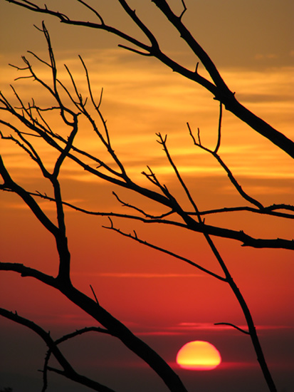
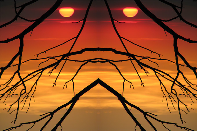
I was thinking that I really liked this image I made of a sunset from last January…


January sunset & branches


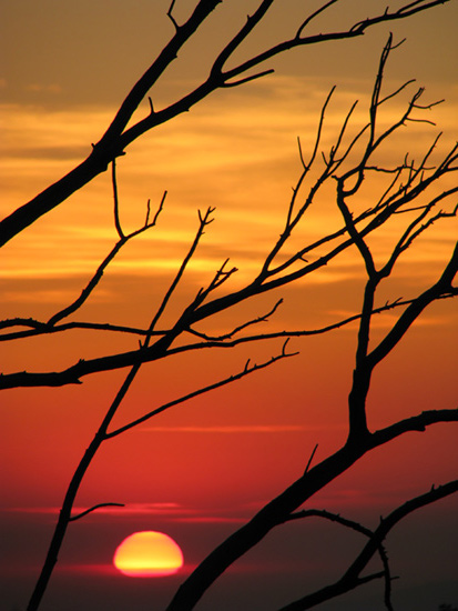
I wondered what it might look like if I flipped it horizontally…


January sunset & branches, flipped


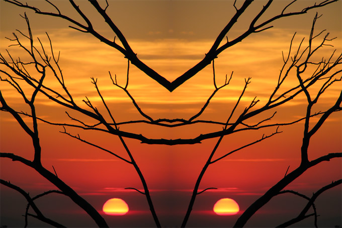
I decided I didn’t like that as much. But, then I thought… Maybe you need both! So, I decided to see what they would look like side-by-side…


January sunset & branches, side-by-side


Actually, what resulted was sort of a happy accident. I had intended on putting the two images together in a manner similar to the image I shared here with a thin black border between. I happened to place them too close together and (fortunately!) I saw this marvelous pattern and shape appear. I love when you can do something in a graphics program with your photo that manages to retain its essential nature but also adds a new dimension or element. In this case, it was already so fantastical and surreal that I thought I would go just one step further and turn the image upside down…


January sunset & branches, upside down


Now, I had originally planned at this point to tell you how excited and impressed I was by the figure that appeared to me when I stared at this last image… But then I thought it might be more fun (à la the interactive-cloud-gazing post) if I asked y’all:  What do you see?

*grin*

[P.S. When I was trying to come up with an interesting name for this approach (technique?) (style?), a few of the words that I was playing around with were “mirage” and “mirror image” as both terms seemed apropos. It dawned on me that the first word was contained within the letters of the second. I thought that was nifty! Though, perhaps there’s no great surprise in this as apparently the words “mirror” and “mirage” share the same Latin root — mirare, meaning “to look at, to wonder at”.]

Harsi / July 29, 2011 / fun stuff, photography, skies / 5 Comments

The One with The Crow & The Rain

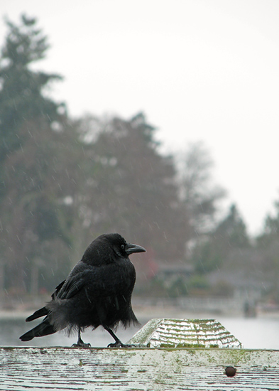
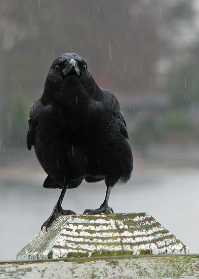
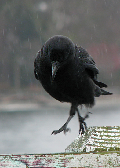
I snapped the following series of images of this crow as it was sitting on the railing adjacent to the vehicle queue for getting onto the Seattle ferry over to Vashon Island. ** As always, click on the photo for an embiggened view. ** Just for fun, I’ve included a rough (very rough) facsimile of the accompanying dialogue between me and my husband…

“Roll your window down, hon.”
“What?!”
“Let me try and get a few shots past you, out your window.”
“We’re going to start moving any second now to get on the ferry!”
“I know, I know… so hurry up already!”

Crow + rain + the Seattle ferry

“Aren’t you a lovely bird? And posing so nicely for me too — thank you!  Boy, you look wet.”
“Hey… Speaking of wet… Me and the car are getting kind of soaked over here.”
“I know… sorry! Just a few more… and then you can roll it back up, I promise.”


Crow + rain + the Seattle ferry


“Are you getting anything decent?”
“Yup! These are pretty… The muted colors of the background and the water… the rain falling… the way light is hitting its black feathers. In fact, I’m really happy with these! Thanks for putting up with me, hon.”
“Yeah, yeah, yeah… So, do you think it’s just an American Crow, or is this one actually a Northwestern Crow?”
“I don’t know, I’m still trying to figure out how to tell the difference exactly. I need to check the field guide again.”


Crow + rain + the Seattle ferry


“Oh, hey… Wow! It looks like it’s dancing in this shot!”
“Dancing?!”
“Well, it’s doin’ something fancy with its feet…” *GRIN*

[NOTE: Differentiating between these two species of crow mostly involves geographic range and habitat, as well as some variation in call sounds. However, I gather that there is also a fair bit of hybridization between American and Northwestern Crows, which makes it all the more difficult to tell for certain which species you’re dealing with. I’m fairly certain that we must have seen at least a few Northwestern Crows (a new species for us) in the course of our more than week-long visit to Washington… just don’t ask me which ones they were exactly.]


Harsi / July 24, 2011 / birds, photography, travel, weather / 2 Comments

A Most Welcome Visitor

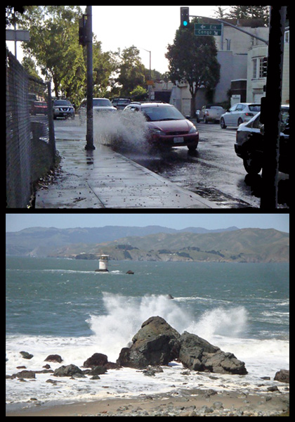
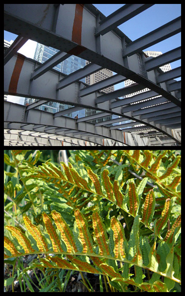
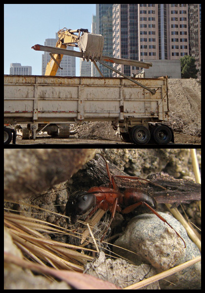
When I put together my post, “Common Ground”, I was hoping that I’d get a little positive feedback or perhaps some discussion surrounding the concept. I honestly was not expecting to inspire anyone else creatively. So, you can imagine how pleased I was when my friend Ruth e-mailed me several of her own paired photos! Viewing her unique and wonderful interpretation of the overlapping themes in natural vs. man-made structures and scenes was a real joy for me. I loved the thought of this idea evolving into a community art project of sorts. I promptly asked Ruth if she would mind my sharing some of her images on my blog. She was gracious enough to agree and I am thrilled to present them here…


[NOTE: *Click on any of the photos below to see a larger version.* Quoted captions are excerpts from Ruth’s e-mails. All of the photos in this post (except for the ant) are the property of Ruth Gravanis. If you are interested in re-posting them or using them for any other purpose, you must ask her permission first. You may contact me via this blog if you wish to get in touch with her.]


Guest photos by Ruth Gravanis.

(top) “while waiting for the bus on a rainy morning on a street near my house”
(bottom) “looking across the Golden Gate, from the Presidio of SF to Marin County”


Guest photos by Ruth Gravanis.(top) “partially de-constructed aerial bus ramp in downtown SF”
(bottom) “polypody ferns on YBI [Yerba Buena Island]”


And last, but certainly not least, she sent me an image of hers to pair with one of mine from a previous blog post:


Guest photos by Ruth Gravanis.(top) “Transbay Terminal demolition, 10/25/10”
(bottom) big unidentified ant, foraging 5/27/10


I hope that Ruth will continue to send me her photo pairings as I truly do enjoy seeing them! All of her images were taken in the City and County of San Francisco. The added dimension of “place”photos taken in geographic proximity to where one lives — makes these all the more special I think.


Of the small (but very loyal) band of friends that read my blog, many of you are also naturalists and photographers. It would be great fun if anyone else feels like joining in and trying their hand at pairing some photos of their own!


Harsi / July 23, 2011 / arthropods, not nature, photography, plants, water / 5 Comments

Selective Color

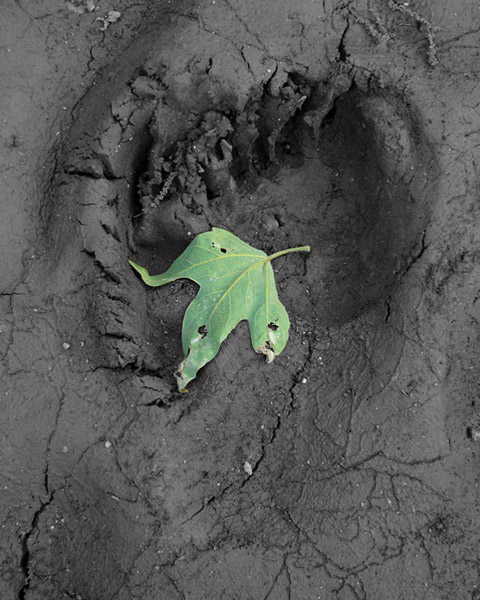
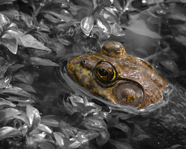
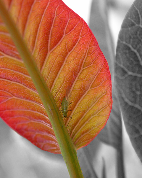
One of the Photoshop techniques that I enjoy applying to some of my photos involves desaturating the image to remove all of the color and then selectively painting portions where I want to bring it back. It can make an artistic statement, draw the eye to a particularly lovely element, or help to make the primary subject matter stand out from a similarly-colored background. Here are a few that I’ve been playing with over the last several months…


Black Bear footprint & sycamore leaf

California Black Bear (Ursus americanus californiensis) footprint with fallen California Sycamore (Platanus racemosa) leaf in mud.


American Bullfrog & aquatic plants

American Bullfrog (Lithobates catesbeianus) hiding among aquatic plants in pHake Lake at the Robert J. Bernard Biological Field Station.


Aphid & Laurel Sumac leaf

Aphid on young Laurel Sumac (Malosma laurina) leaf.


Harsi / July 20, 2011 / amphibians, arthropods, mammals, photography, plants, tracks / 2 Comments

Common Ground


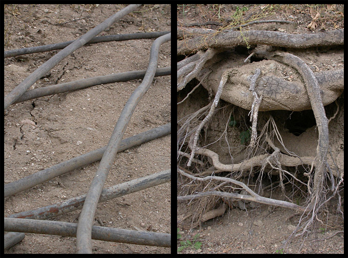
Pipes & Roots - Common Ground Series

This is one of a series of images that I’ve been playing around with for awhile… Juxtaposing photos of organic and non-organic subject matter. In this case, there’s an interesting thematic similarity in that both the metal pipes and the exposed tree roots are used to convey water. But, in general, I’ve simply been playing with analogous patterns, lines, color or light.

Any thoughts or insights on this concept? I’m quite certain it’s not an original one… Just wondering if it works effectively here?

Harsi / July 11, 2011 / not nature, photography, plants / 2 Comments

Seeing Spots

Counting animals in the field can be tricky. They have a habit of not staying still.

Oh sure, I’ve tried explaining to the newts cruising around the creek that it would be very helpful if they could just stay in the same place long enough for me to get past number 5 or 6 before I become hopelessly confused and have to start over again. But, well, you know how willful and restless a newt can be, right??! *GRIN*

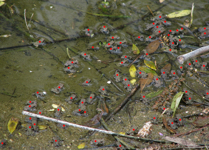
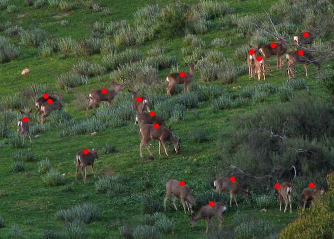
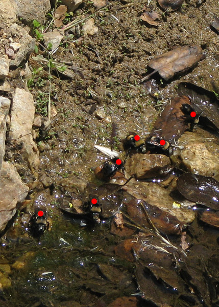
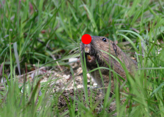
One of the many wonders of photography is that it affords me the option of sitting in front of my computer to study images taken in the field that will give me accurate data. In many cases, far more accurate, than my attempts at eyeballing a large group in person. As I count, I mark each critter with a red dot so that I know if I missed anyone and to make certain that I don’t double-count by accident.

In spring of 2010, at the Robert J. Bernard Biological Field Station, several ponds were teeming with newly hatched California Toads. Here’s what SEVENTY of these tiny hoppers looked like:


California Toad juveniles, count

This past March, I saw a large herd of Mule Deer grazing in the horse pasture here in the canyon. I thought it might be the most numerous group I’d ever seen… turns out I was right! There are a total of NINETEEN in this image. I’m curious if anyone else has ever seen a larger herd of Mule Deer than that?


Mule Deer herd, count


Some of the numbers I come up with are less impressive, but the information still fascinates me… Bees and wasps are frequent visitors to any local water source, especially as temperatures go up and humidity levels start to plummet. I watched intently as several identical-looking bumble bees repeatedly returned to the same spot next to the creek. They were zipping in and out of there so fast though that I wasn’t sure just how many I was watching. The answer was SIX!


bumble bees at creek, count


Of course, at the end of the day — especially a really, really, long day when you’re more than a little stir-crazy from being stuck inside with the flu — you can even have fun counting to ONE.

Botta's Pocket Gopher, count


Final bit of amusement courtesy of one of the local Botta’s Pocket Gopher… I know that many people have nothing but contempt for these little guys, but I can’t imagine holding a grudge against this industrious digger… that expression melts my heart every time!

Harsi / June 29, 2011 / amphibians, arthropods, mammals, photography / 2 Comments

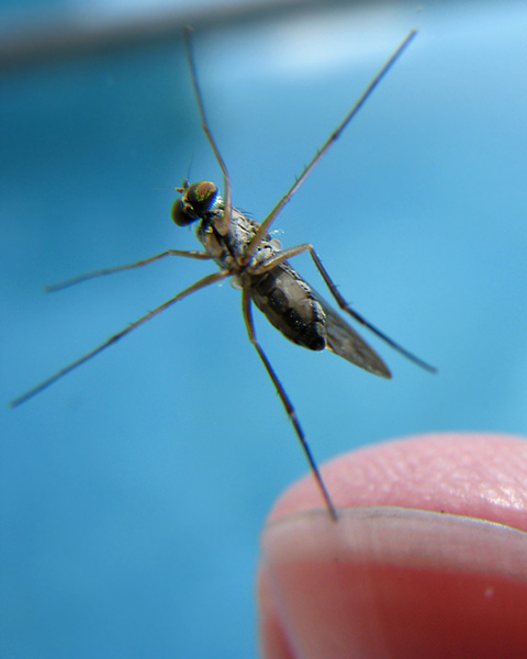
Teaching an Old Fly New Tricks

fly balancing act


Most children have a bug period, and I never grew out of mine.

Edward O. Wilson


** Extra-special bonus points for the first person to tell me how it’s done! **

Harsi / June 24, 2011 / arthropods, photography, quotations / 7 Comments

Detail-oriented

I don’t think there has ever been a time in my existence when I wasn’t fascinated by the small details of life. My mother has told me stories of how ridiculously long it took to walk anywhere with me when I was a toddler as I kept stopping every few feet or so to inspect something that had caught my interest. For anyone who’s ever had the experience of walking somewhere with me today, they can probably attest that not a lot has changed! *GRIN*

Though it can be distracting (and occasionally overwhelming), my heightened attention to very small details is not a trait I would ever really want to change. I think it is an essential component of being a good naturalist… and photographer too. Being able to see small differences in two different shots can be very useful when editing a large number of images. Paying attention to how an image makes you feel if you alter the exposure a little or experiment with a slightly different crop can really improve your finished product. Of course, sometimes I wonder if the things I get hung-up on are perhaps too subtle for most people to care about. For instance, I was working on this image today:


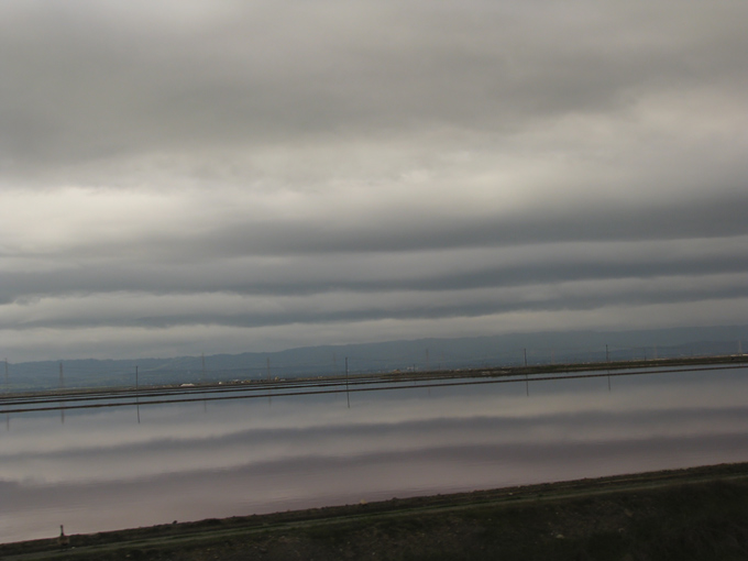
sky & water pre-crop


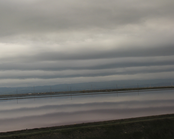
This gorgeous scene was captured from the window of the train on the return leg of our trip to Seattle. The body of water paralleling the tracks provided a perfect mirror image of the striated sky above. The colors were subtle and perfect. This is the image I took, full-frame, nothing done in post-processing except to adjust the exposure a bit. I wanted this to feel somewhat abstract. I wanted it to be more about the repeating colors and lines than about the context of the scenery per se. As I stared at the above image, something just wasn’t sitting right for me. So, I cropped it, like this:


sky & water cropped


If you can immediately tell the difference between these two shots… well then, I am impressed! This crop did serve some practical purpose because my camera creates images that are roughly 8 x 10.6 inches. These dimensions are not particularly useful for making prints and cropping this to a standard size of 8 x 10 inches makes sense. But, that’s not why I did it. My reasons were far less obvious…

I am always trying to understand how someone’s eye reads a photo or piece of artwork. I think there are ways to guide the eye. To subtly suggest where the focus should be and how the eye travels to get there. My goal with this piece was to have the viewer’s eye follow the repeating horizontal lines in a way that would feel seamless… flowing, I suppose. Back and forth, like a typewriter, spewing pastel lines of clouds and water. I wanted to include the land below the water because it anchored the whole scene a bit and gave a hint of context. But foreground — especially darker foreground — is always going to draw the eye, and in this case, my attention kept being inexorably drawn to that tiny dark blob in the lower left corner. A little bump that made me stop and scrutinize when I wanted to just keep gliding back and forth.

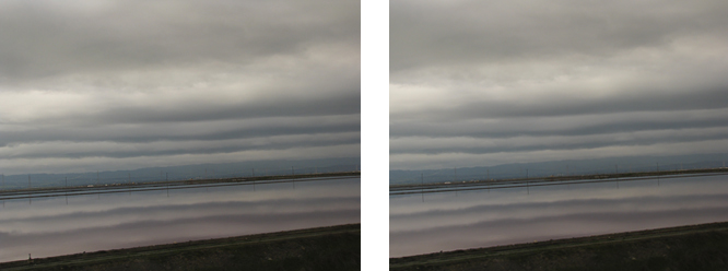
At this point — if you’re still reading — you’re probably thinking 1) this woman is more than a little neurotic, and 2) does it really make any appreciable difference? Well, I freely admit to the first point… and as to the second, who knows? I felt instantly better about the whole thing after cropping it, but I have no idea how it translates to others. I’d be happy to hear what you think! Here are the two images side-by-side:


sky & water compare*Click on this (and the above images) if you want to see a larger view.*


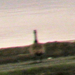
Eventually, after staring at these two images for long enough and putting this blog post together, I began to second-guess myself. What was the big deal with the little blob anyway??? It finally dawned on me that it was the “blob” part that wasn’t working for me. Though a small protrusion, it poked up out of an otherwise congruous series of lines and drew attention. But then, to further frustrate things, I simply couldn’t resolve what I was looking at and that made my eye linger even longer on this spot. At this point, curiosity got the better of me and I enlarged the image and seriously increased the exposure to get a better view of the inscrutable dark lump.


sky & water blob revealed


Surprise! It’s a GOOSE!!! A Canada Goose, with its back to the camera, to be exact. Hah! Now, if this goose had been more visible, recognizable as a goose from a distance, there is no way that I ever would’ve considered cropping it out. That would have been a perfect destination for the viewer’s eye — traveling across the image and settling on this lone bird also surveying the unfolding scenery. Ahhh, but it wasn’t meant to be this time around, I guess.

Hmmm… re-reading this post, it seems awfully long and meandering. Not sure if anything I’ve written will be of interest to anyone. Just trying to give some insight into my creative process, which at times can perhaps be overly rigorous. More and more, I recognize that I must give myself more freedom to have fun and be spontaneous with my photography… but, the details do matter to me and they probably always will. And… I’m OK with that!

Harsi / June 10, 2011 / photography, skies, travel, water / 4 Comments